


Today you will…
...Explore notions of global citizenship, interdependence and uneven development, through discussion of current protests around the world about globalisation and inequality.
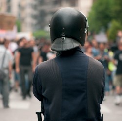
So what are the aims of the Occupy Movement, anyway? Even teens who are particularly interested in and aware of current affairs could be forgiven for having a somewhat sketchy notion of what the protests are actually about; media coverage has been pretty patchy so far, often emphasising what is widely perceived as a ‘lack of focus’ on the part of those taking part. You can be pretty sure, however, that your class will have seen footage of a canvas village outside St Paul’s Cathedral, and police driving protestors from downtown Oakland and Manhattan. And on some level, they’ll be intrigued.
The fact that there is no clear list of demands being waved along with the banners doesn’t mean that the banner-wavers don’t have a valid point to make; and as every teacher knows, where there are banners, there is the chance to engage young learners with the issues involved in a way that feels both dynamic and relevant. A way they can own. This lesson explores the meanings of inequality that give rise to ‘the one per cent’ and ‘the ninety-nine per cent’. Just don’t be surprised if a few of your pupils go tent shopping afterwards…
Starter activity

Having your cake…
A quick and active demonstration of the unequal distribution of global wealth is to take a cake (this could be a real one if you’re feeling generous – and food intolerances allow – or a paper representation), and five plates, to represent each twenty per cent of the population. Refer to one end of the row of plates as the richest 20% of people and the other end as the poorest 20% of all.
Cut a slice from the cake that represents about 17%. Put the remaining 83% on the plate for the 20% richest.
Q: Is that fair?
Cut the small slice in half and put one piece on the second richest. Halve the remainder again for the plate representing the third or middle sector. Halve the small remainder again to share between the fourth 20% and the poorest 20%.
Q: Who has the global wealth?
For an alternative, musical starter on the probity of the financial sector, you could play ‘Arrogance, Ignorance and Greed’ by Show of Hands, then hand out copies of the lyrics for discussion.
Main activities
1. Minding the gap
In December 2011, the Organisation for Economic Co-operation and Development (OECD) noted that income inequality among working-age people has risen faster in Britain than in any other rich nation since the mid-1970s.
Average annual income change 1985-2008 (SEE FIG 1)
OECD based its measurements on the Gini coefficient, where countries are ranked between a figure of zero, where everyone earns the same, to 1, where the richest person has all the income.
In groups, encourage students to identify the key questions from this graph such as:
• Which country on this table shows the least increase in inequality?
• Which shows a decrease in annual income for the poorest 10%?
To help take this further, The Guardian DataBlog is supplied with analysis, interactive graphs and downloadable data.
2. Evicting an idea?
In ‘The Last Days of Occupy’ Laurie Penny writes that the mainstream press makes the mistake of thinking Occupy was ever about specific demands. “Rather, it is about retaking psychic and physical space amid the self-satisfied centres of capital. It is about using that space to build tentative prototypes of a new social system, created by and for people failed by the present one.”
Occupy are not alone in their concern:
“Growing inequality should now be the priority for leaders after the economic crisis, senior economic figures at the World Economic Forum (held at Davos) have said. They insisted that more needed to be done to tackle excessive pay, poverty and unemployment.”
Source: bbc.co.uk
Introduce students to the idea of the Tent City University tentcityuniversity.occupylsx.org/ . Divide them into small groups and ask them to prepare a short presentation of ideas for global fairness and justice to be made to the Tent City University, using whatever media they feel appropriate (maybe they could do it by means of a video broadcast, an illustrated mind map, or even a musical performance).
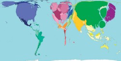
3. Looking at the distribution
The starter activity provides an effective preparation for consideration of global wealth distribution using data on world maps and UN Human Development Indices. Worldmapper represents the area of countries according to the data for each topic. Look at the map showing Wealth projected to 2015 (worldmapper.org/display. php?selected=164). Read the quote and the analysis next to this map.
Q: Which countries are forecast to have the most significant increase in wealth by 2015? And why?
Also look at these world maps: Human Development Index worldmapper.org/display. php?selected=173
Human Poverty “Poverty is not just a financial state.” worldmapper.org/display. php?selected=174
Q: What do these maps suggest about the unevenness of global measures or indices?
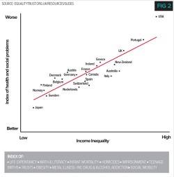
4. Exploring inequality
We should not focus on wealth alone, as demonstrated by the data-rich study called The Spirit Level. There are other measures that assess our quality of life. This graph (Fig2) shows an index of health and social problems plotted against income inequality:
Q: Which countries are the most and least unequal? How do they rate on health and social problems?
Q: Choose two more countries between which to make a comparison.
Q: Which European countries have the lowest inequality and better index of health and social problems? What do you think they might be doing that other nations are not?
Home learning
gapminder.org/videos/crisis-narrows-chinauk-gap/
This beguiling video presented by Hans Rosling has a dynamic graph plotting life expectancy against income shown since 1800. It demonstrates a transition of countries from being poor and sick to rich and healthy. Rosling says towards the end here ‘the gap is closing’ but also picks out China’s in-country variation.
Q: How does this change your understanding of the position of China in the world? Justify your opinions.
Summary
Professor Danny Dorling (geography’s Brian Cox!) persuasively argues in “Injustice: Why social inequality persists” that there is growing inequality. It is shocking, he says, that ‘in countries such as Britain people last lived lives as unequal as today, as measured by wage inequality, in 1854, when Charles Dickens was writing Hard Times’; reading an extract from Hard Times might help to emphasise the force of this statement for students.
Q: As a check on their understanding of the concept of inequality, and the ability to draw conclusions from data, ask students to explain the importance of inequality, using examples from Britain and on a global scale.
In addition to dealing with the big ideas it is important to remember that behind the data there are billions of individual lives in real places. Each one has the same human rights yet many exist below their basic daily needs. It doesn’t have to be like that. We need to ask the right questions.
Q: What might those questions be?
Info bar
Additional resources
Source: http://u4ya.ca/blog/?p=6
See also:
occupy.lsx.org
bankofideas.org.uk
guardian.co.uk/uk/occupy-london
Stretch them further
• Richard Wilkinson, how economic inequality harms societies, ted talk 2012 (video 17 mins)
• ted.com/talks/richard_wilkinson.html
• About the expert
Angus Willson is a geographer, educator, and consultant based in Ashford, Kent. Working with government departments, companies and voluntary-sector organisations, he has a keen focus on professional engagement for curriculum-making and leadership.pannage.com